Hi! Welcome to my blog, in this blog I will study two websites for my own . I believe that, this research will assist me in understanding how to create my own website so I will get my ideas from these website and reflect the ideas to my own website.
I will be looking at SOM website and ARK-SHELTER website for my research. These websites are not architects these websites are architecture firm websites. So, to talked about these websites first thing I saw both of them have videos on their Home Page. In my opinion using videos for architecture websites is the one of the important requirements.
I will begin by looking at SOM website. Below you can view the homepage and the layout.
So this SOM website has blackground and have 4 sections as you can see.(Expertise, Ideas, Culture and Ideas). I find the homepage very basic and simple however this typer of websites are way better than the other busy websites. As I mentioned before the home page is showing us a video of building. While using videos on websites you might draw attentions of customers of you building it is better rather than using photos. The customer can understand the sizes of the building while looking to videos.
Then I clicked into Expertise to view the firms project
I zoomed out the website to take a good screenshot, so that's why the menu section looks small.
As can be seen here the page white background and menu is still on the top-side which menu section is in black and the fonts are white. When I scrolled , we can see that there is a world map that shows the places where the projects located so by showing this places you can easily understand that this firm is very huge and has handled major projects. It is easy to click to the menu section from the map because the buttons are big enough to see it.
After that I have looked to the Ideas section, as you can see below;
This page is about obviously about the ideas of this firm, they are telling their researches, innovations and stories. There are many details about their ideas on this page, which I really loved.
For the Culture page, they are talking about the inspiration from the environment for instance. "We’re inspired to work as citizen architects, focused on a bigger picture and purpose. Through our design work and our role as industry leaders, we’re seizing the opportunity to respond to urgent environmental challenges".
Yasemin Kologlu, Principal
“Environments can empower the utmost human potential, foster culture and community, and stimulate pride and joy. I am continuously inspired to work with a team of creative individuals who are committed to improving the human experience.”
Carlos Madrid III, Associate Principal
So these types of quotes can help your firm to get more interest from customer because giving more detailed informations are important for a company.
So lets look at the About page, this page has photos of their buildings and their steps about their projects, for instance how they planned their project or which type of material they have used for their building.
The last page I will look at here is the Contact page, this page is clear and simple in design with a consistent Arial font using black text on a white background. This page does include email contact , county, interest, studio links and social media links however these could have been added as icons for increased and easy usability as many people would not necessarily click into this page and then copy and click these links. The copyright is included on this page and has copyright details for the Skidmore, Owings & Merrill.
Lastly, I checked the mobile view of SOM's website on my mobile phone. I believe this website works better and is laid out better for mobile as it has a menu button on the homepage with clear links to every page, The artworks are easy to click into and are clearly defined as you scroll through the work. On mobile website looks better the photos are placed better however the videos are not showing on mobile version.
I will now look to Ark-Shelter website , as I mentioned when I enter to Ark-Shelter I met with video about firms house. This website about buildings however it vey different rather than the architecture websites , the concept of company is box houses. The buildings are compact and minimalist. The sections are separated into 6 which are Live, Work, Relax, Studio, Gallery and lastly About. So I am going to talk about these sections and discuss them.

The Live section is website's Home page, so the homepage has lots of images about buildings and lots of information about the buildings. Home page explains the summary of the information on the siteAlso this homepage is giving us information about the areas of building which I found interesting. The colour of the page is white and the font of text is arial. When I scrolled the page downwards I have realised there is a brochure about buildings , this type of brochure might help to customers to find idea for their house or building. The homepage is very useful and also there is a button that you can ask a question.
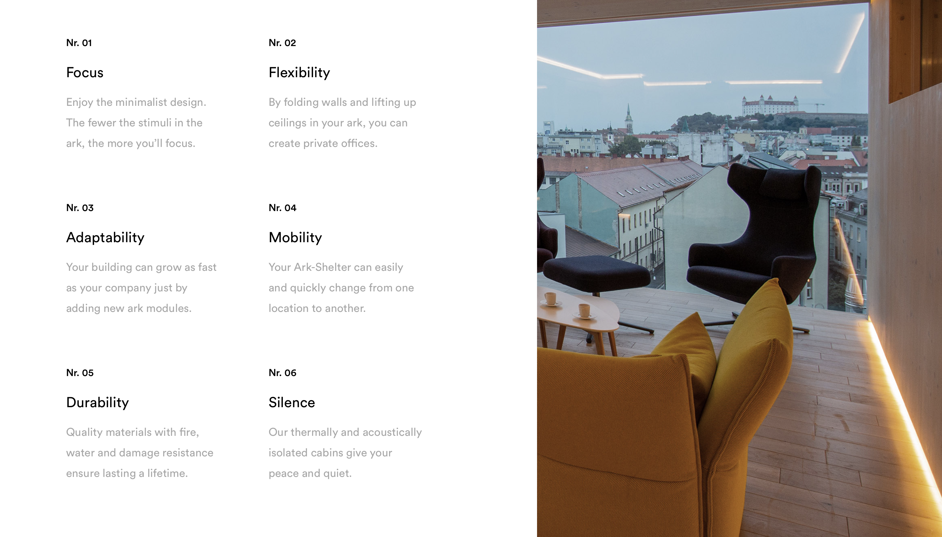
On the work section, this page is mentioned about the minimalist idea like what the company focusing on for the building or arability , mobility, flexibility, durability and silence. The buyer may benefit from these information on this page.

Then I have looked to the Relax page, this page is about the houses that you might get relaxed, for instance there are some images the boxed houses are inside the nature which you can feel relaxed in natural areas.
After that, I clicked to Studio button, this page is showing their plans of the buildings. What I mean by that, it shows how the buildings look in the 3d software and thanks to this, the buyer can more easily understand the size and appearance of the building. These types of apperances really help to customers to analyse the building easily.
On the gallery page, as its in the name the page showing the photos of companies building and projects.
Lastly I looked to the About me page , this page has lots of information about company's employees and rewards that the company got the news about the company.
Lastly I have checked to website with mobile phone to check the mobile view, it has a menu button on the homepage with clear links to every page, The artworks are easy to click into and are clearly defined as you scroll through the work. I think the mobile use of this page is better than the website view.
Comparing both sides, ARK-SHELTER site seems more detailed and more informed. SOM mobile version is similar with the ARK-SHELTER, so I can say both website have no issue on mobile. ARK-SHELTER has more buttons to click and it is easy to click and use rather than the SOM website. Lastly I have realised that using simple colours and fonts can attract peoples interest. Overall this researchers would definitely help my project sign off website. I will use the ideas that I have seen that would fit to my own website for my project sign off.


You have looked at both these sites in detail which is good you could have had a longer summmary and comaprison at the end and more about how this relates to your work
ReplyDelete